Best moving visualization: Lee Feinman, “Chemistry of the climate lesson 1”
Lee's bite-sized video used a casual style reminiscent of Khan Academy and included relatable metaphors to make the topic approachable for a non-scientist audience.
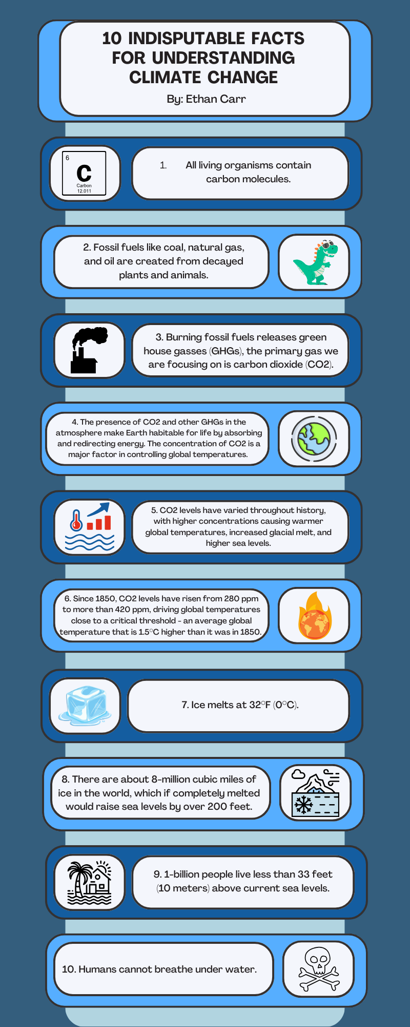
Best infographic or illustration: Ethan Carr and Rebecca Wilson, “10 indisputable facts for understanding climate change”
Ethan's infographic takes an effective approach to breaking down a complex topic by clearly linking one idea to the next and using minimal jargon.
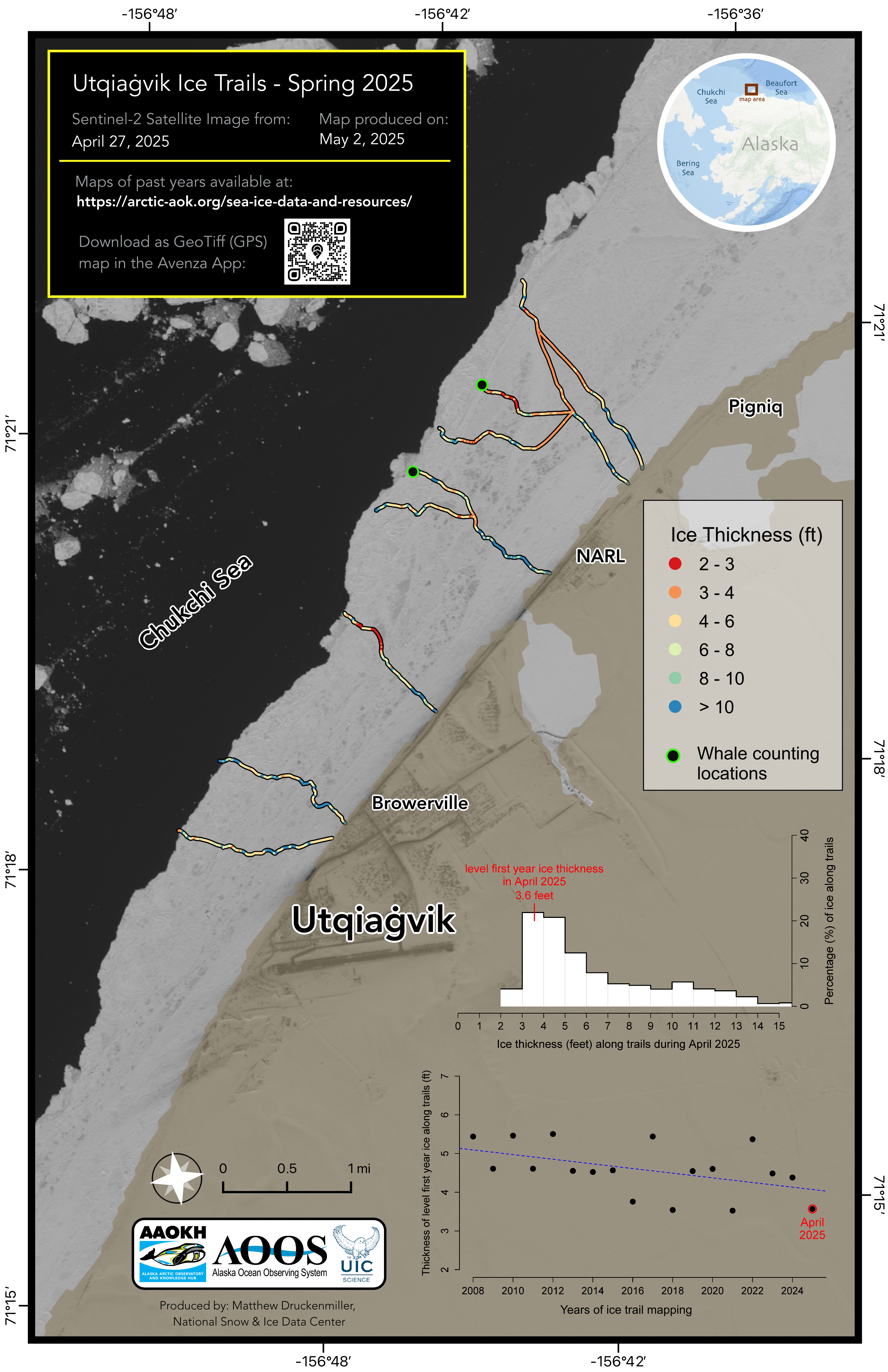
Best static data visualization: Matt Druckenmiller, “Utqiagvik ice trails - Spring 2025”
Matt’s map, targeted to hunters and search and rescue teams in Utqiagvik, Alaska, shows how scientific data can be a valuable resource to local communities.